Freelance Work / Illustrations and logo design by Mary Anne Lloyd / Web Development by Flyte New Media / View the live site
Nearly 20 years ago, Rosemont Market & Bakery opened its first small local food market in Portland, Maine. With paint chips in hand and the talents of an illustrator friend, they created the logo that has become widely recognizable today, proving that good design can stand the test of time. Though Rosemont has flourished since those early days, its mission to provide its communities with the experience of joyful food remains.
When the folks at Rosemont reached out to me, business was booming, and they needed a cohesive brand system to keep them rooted as they continued to grow. While the logo, vibrant color palette, and food illustrations served as a solid foundation, they sought a visual system to communicate in a fast-paced world. Whether Rosemont needed a promotional advertisement, an e-newsletter, or a menu, the visual brand system had to be accessible for the internal marketing team to implement quickly and accurately. Using the logo as a guiding light and keeping the need for usability in mind, I defined a system with free commercial use fonts and large blocks of color like the vibrantly painted walls in the stores.
Packaging design
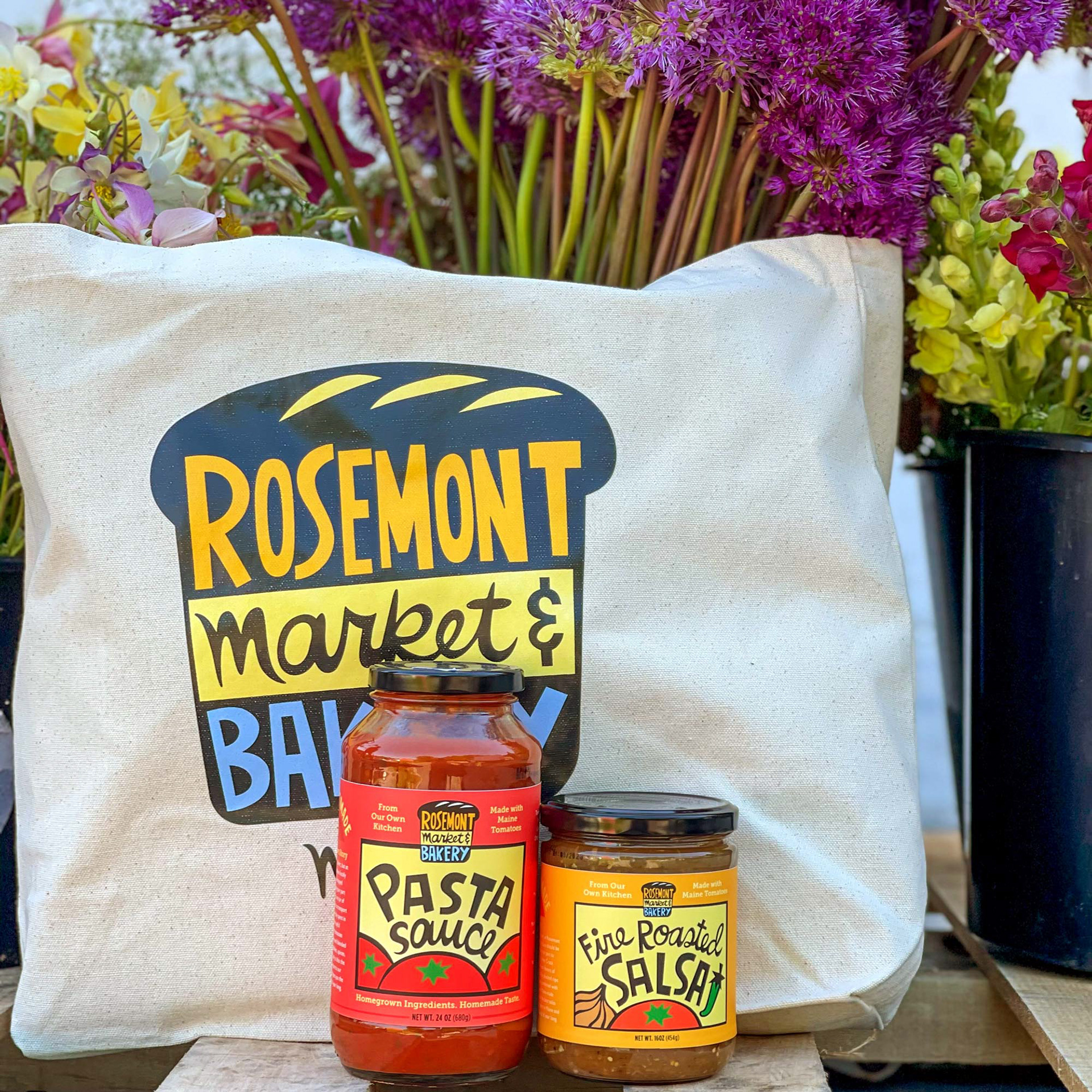
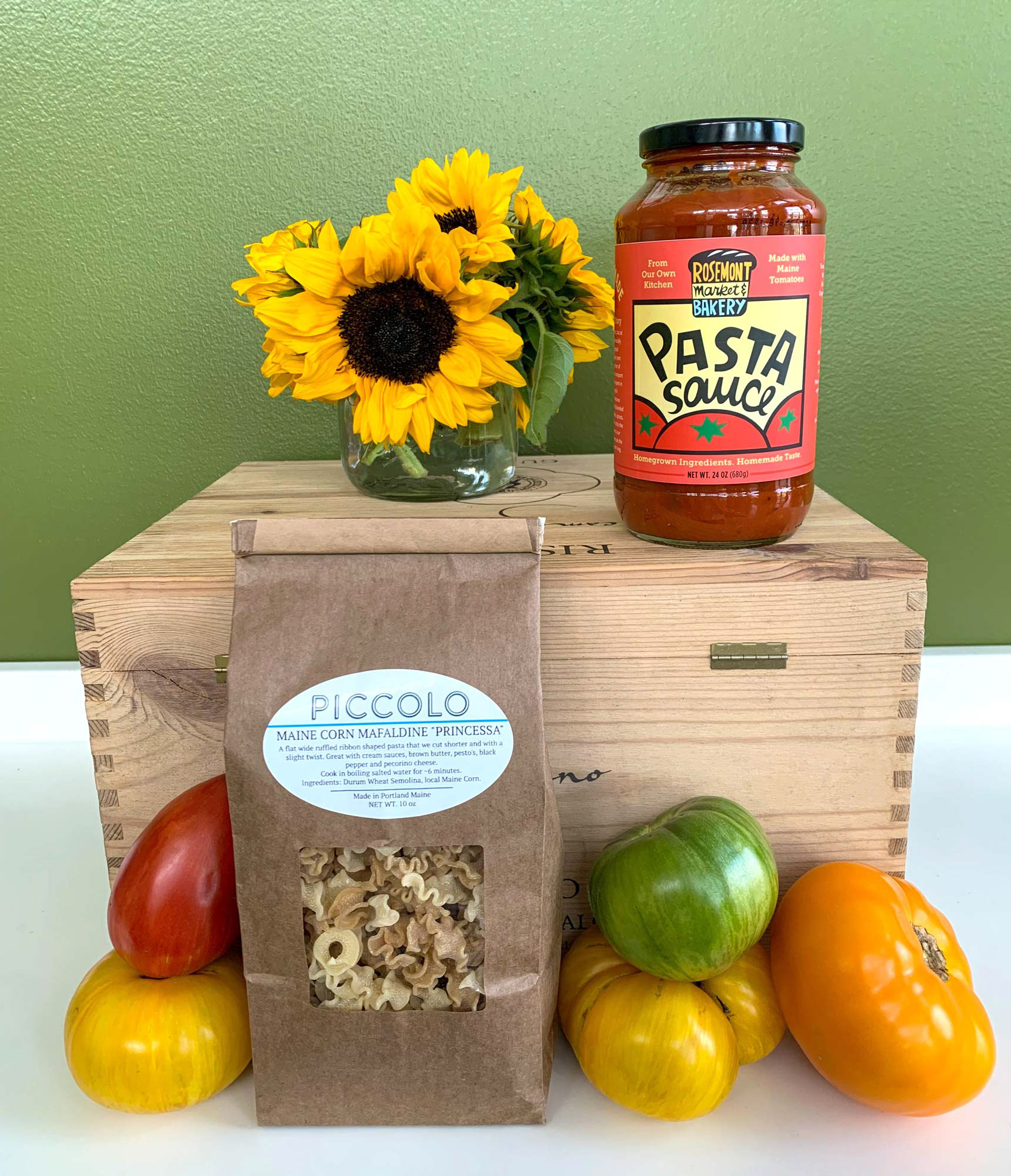
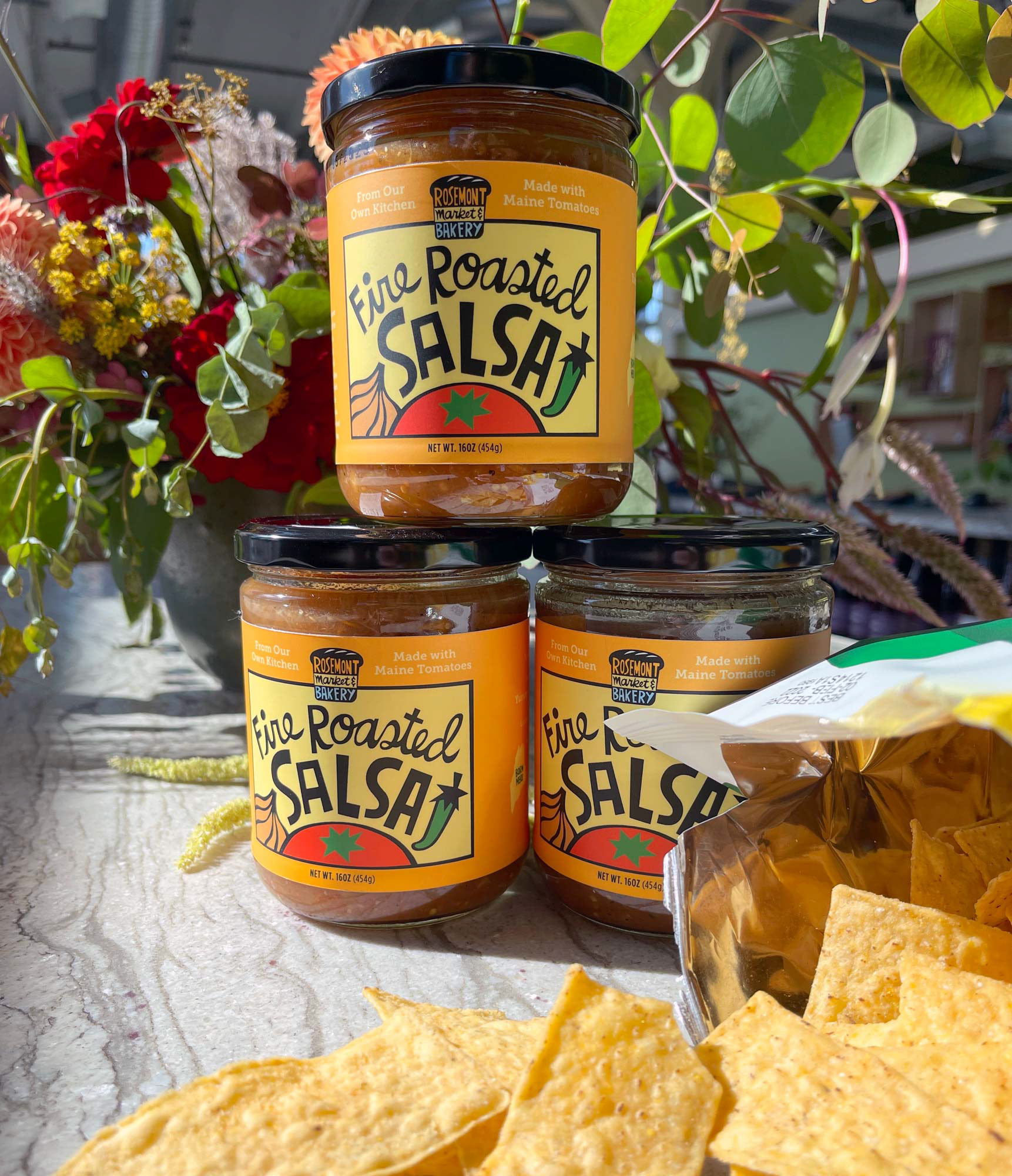
Thanks to a team of talented chefs, Rosemont offers a wide variety of fresh-baked bread and grab-and-go foods. The Rosemont team wanted to make it possible for dinner to be an entirely locally sourced, easier, and more joyful experience for its customers, so they created a line of staples to support that mission. Working with illustrator Mary Anne Lloyd, I designed a set of jar labels for Rosemont's specialty Pasta Sauce and Fire Roasted Salsa. The packaging designs feature the brand's lively color palette, hand-illustrated typography, and playful ingredient illustrations.
Website redesign
Aiming to move the brand into a modern world, the Rosemont team wanted to replace their outdated website with an easily-editable, intuitive, and mobile-friendly design. The new website needed to provide information on each of its seven market locations, showcase in-season and daily offerings, and highlight local suppliers. With my designs turned into a custom WordPress theme by Flyte New Media, Rosemont now has a website that feels on-brand, informative, and user-friendly for its customers, and easily and quickly editable for its internal team.
Mural design
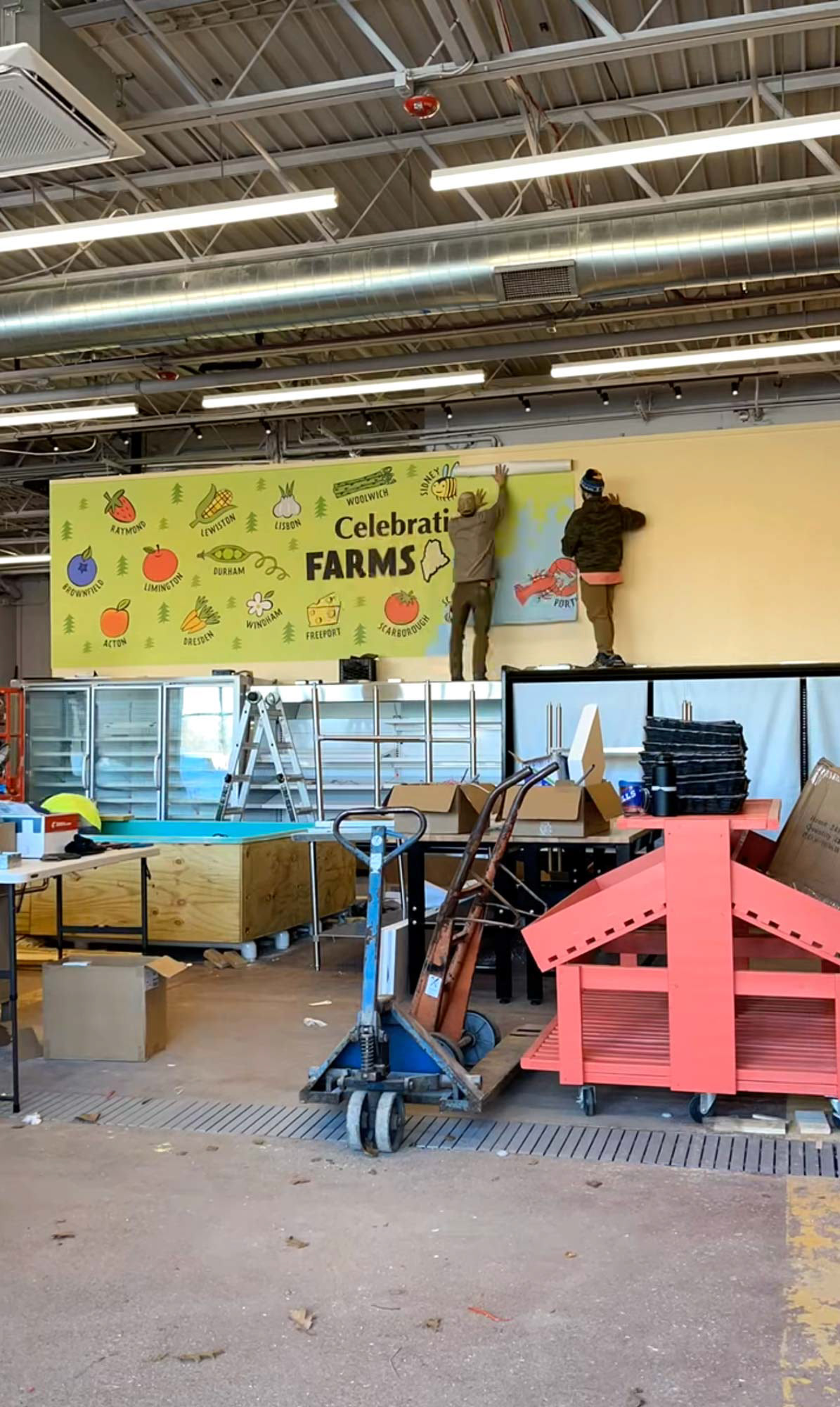
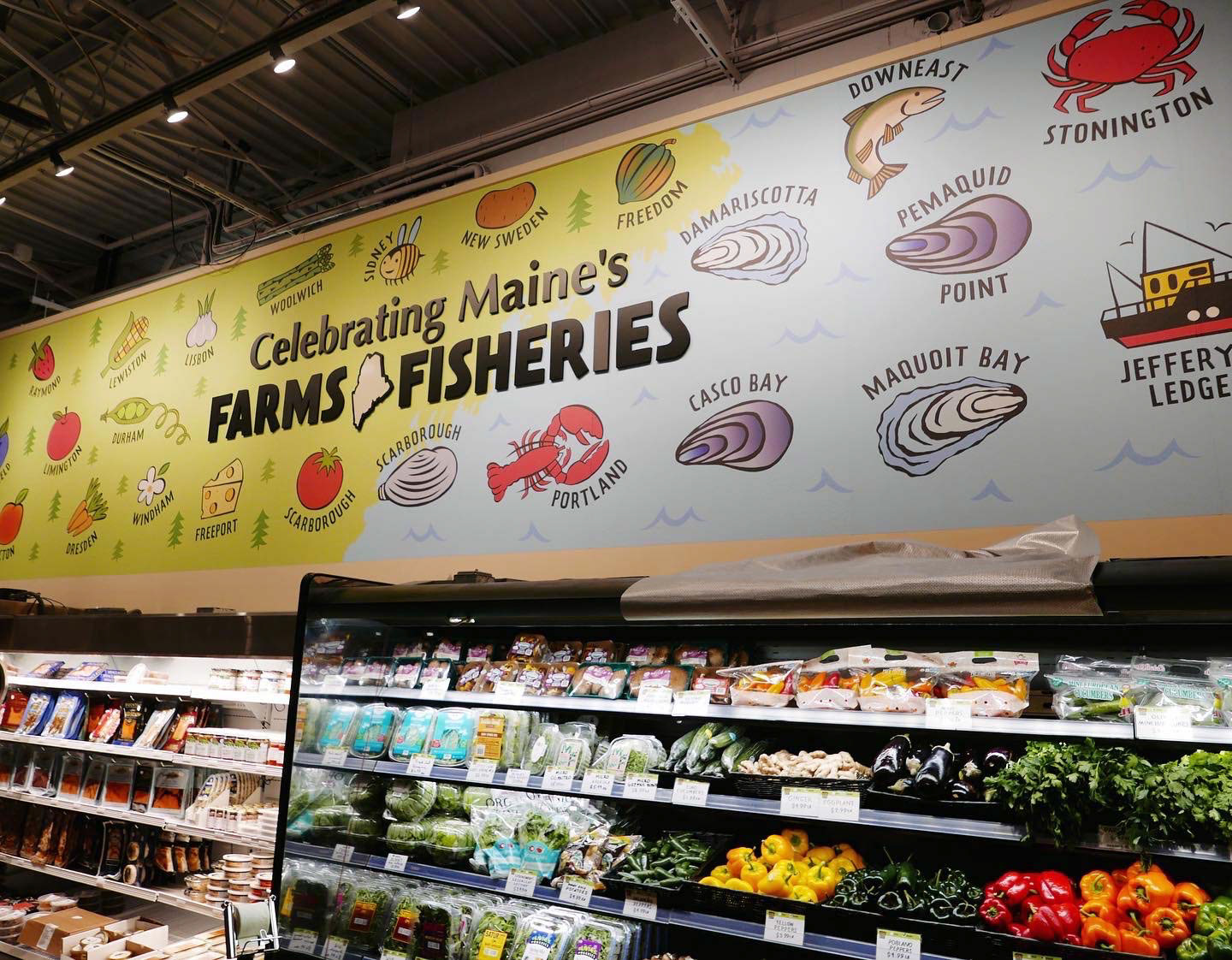
When Rosemont teamed up with Portland's Harbor Fish Market to open a new store in Scarborough, Maine, they needed a mural to celebrate. The mural would take up the entire back wall, uniting the separate sales spaces of both businesses beneath it. With Mary Anne Lloyd's illustrations, the design inevitably embodied the Rosemont brand. A subtle typographic shift called upon Harbor Fish Market's brand elements and united the two businesses under one roof.
Signage
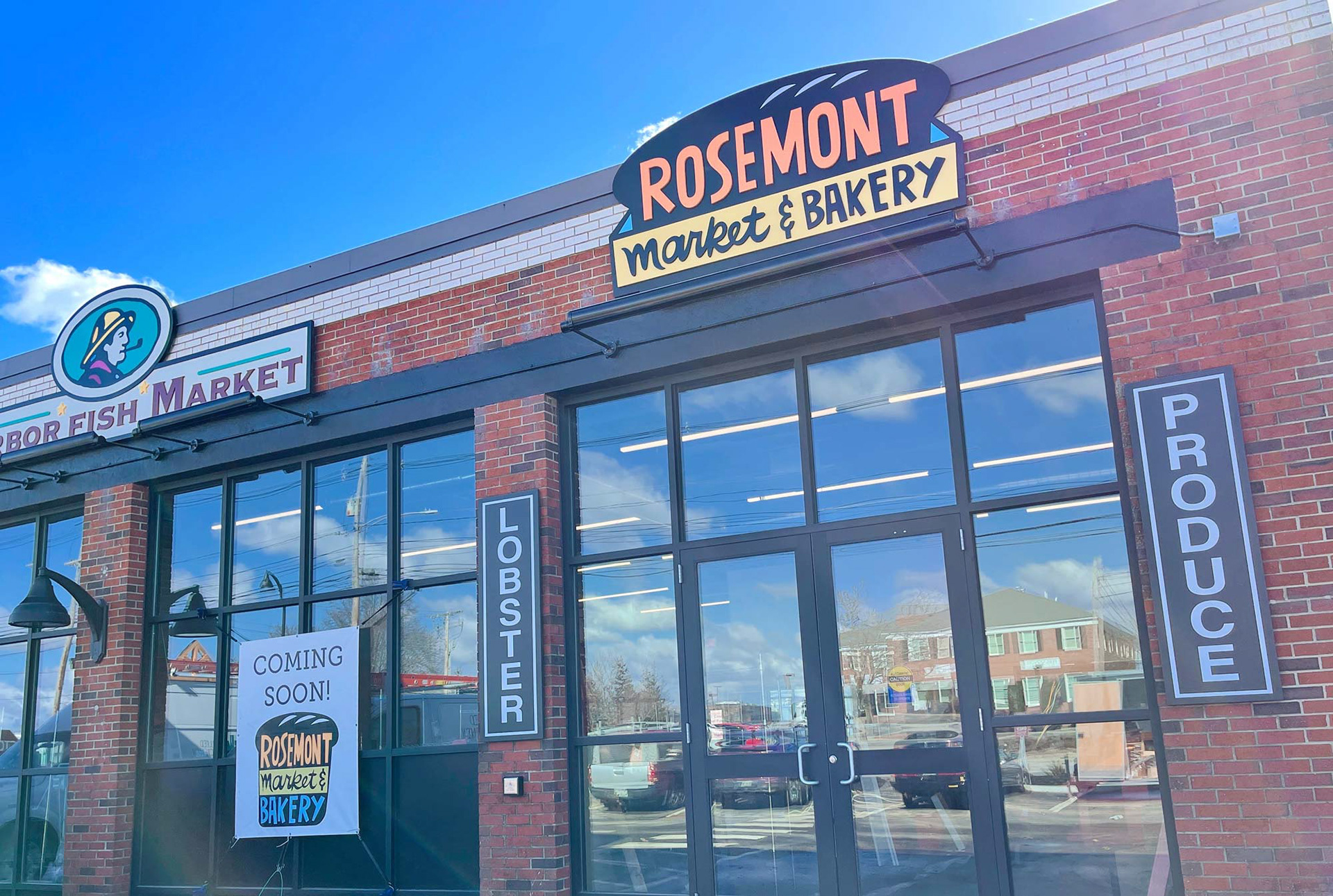
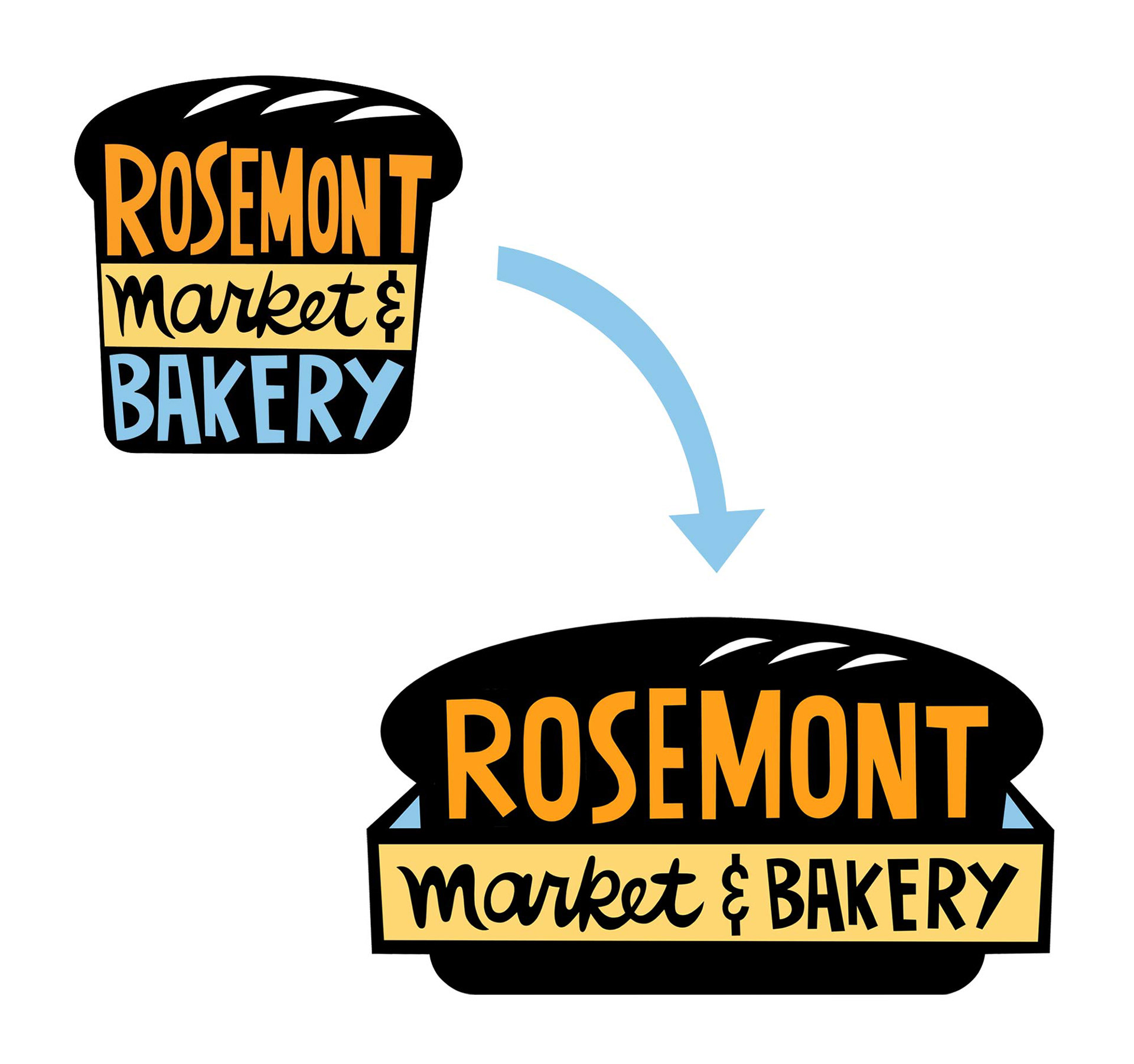
The new Scarborough market offered a limited footprint for a storefront sign, and Rosemont's square logo design wasn't a good fit. Keeping the key elements of the logo intact, I designed a variation that would better utilize the long and narrow space.
COVID communication
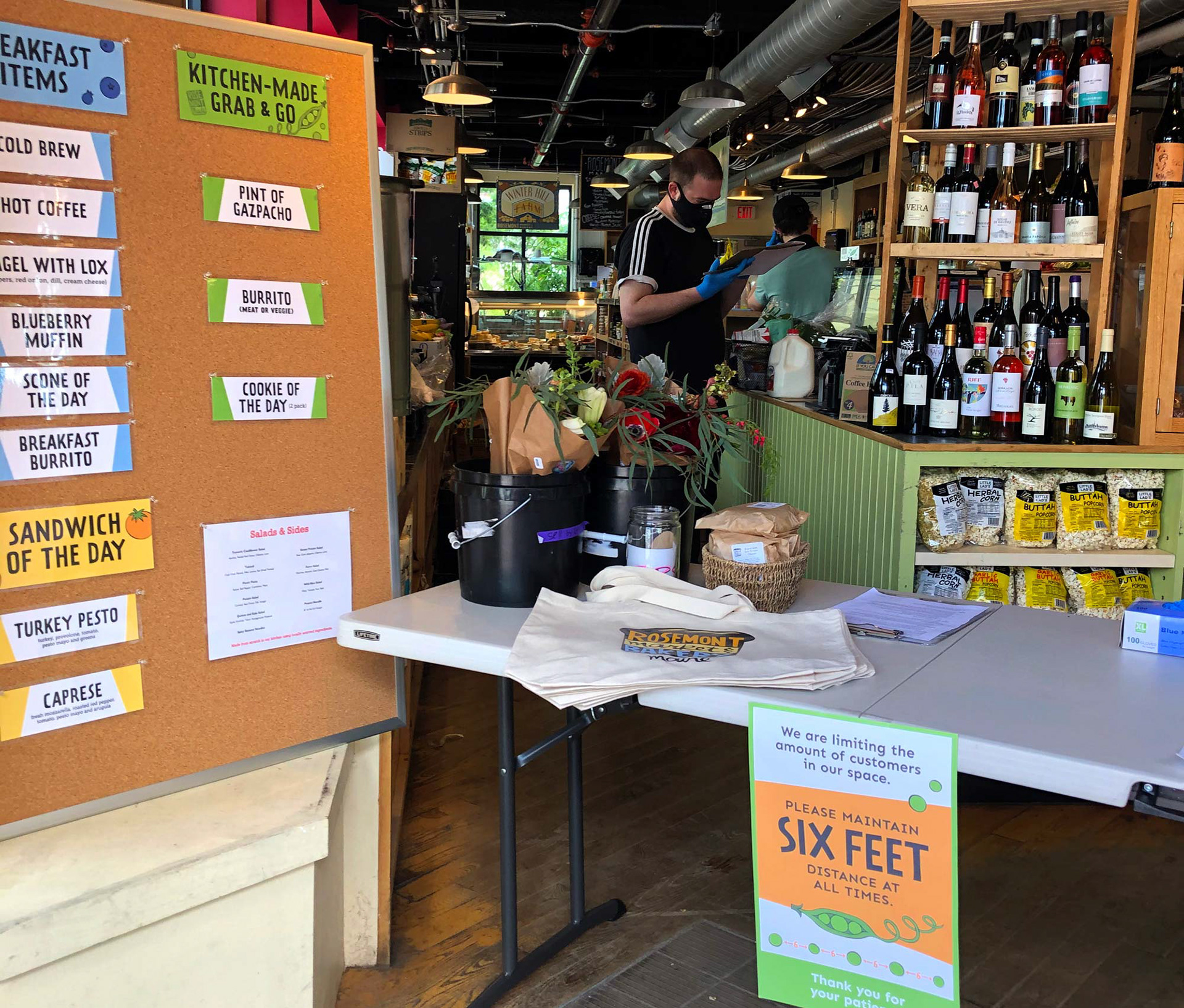
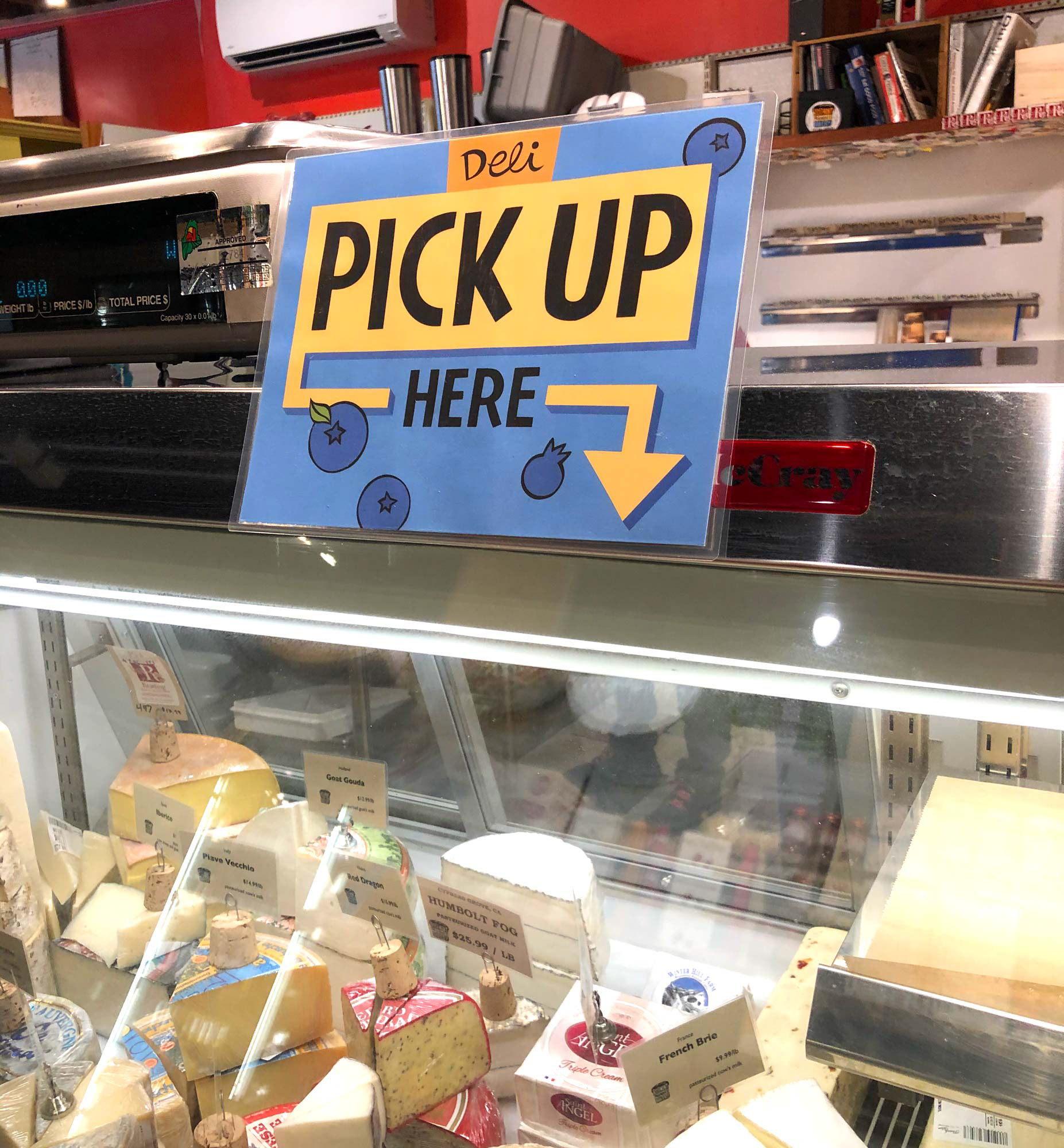
Like every business at the start of the Covid-19 pandemic, Rosemont found itself in uncharted territory. The team quickly shut down stores and implemented a curb-side shopping experience to keep their community safe and fed. With this shift in the business, I helped with behavior change marketing and signage to help guide their customers during a very uncertain time.
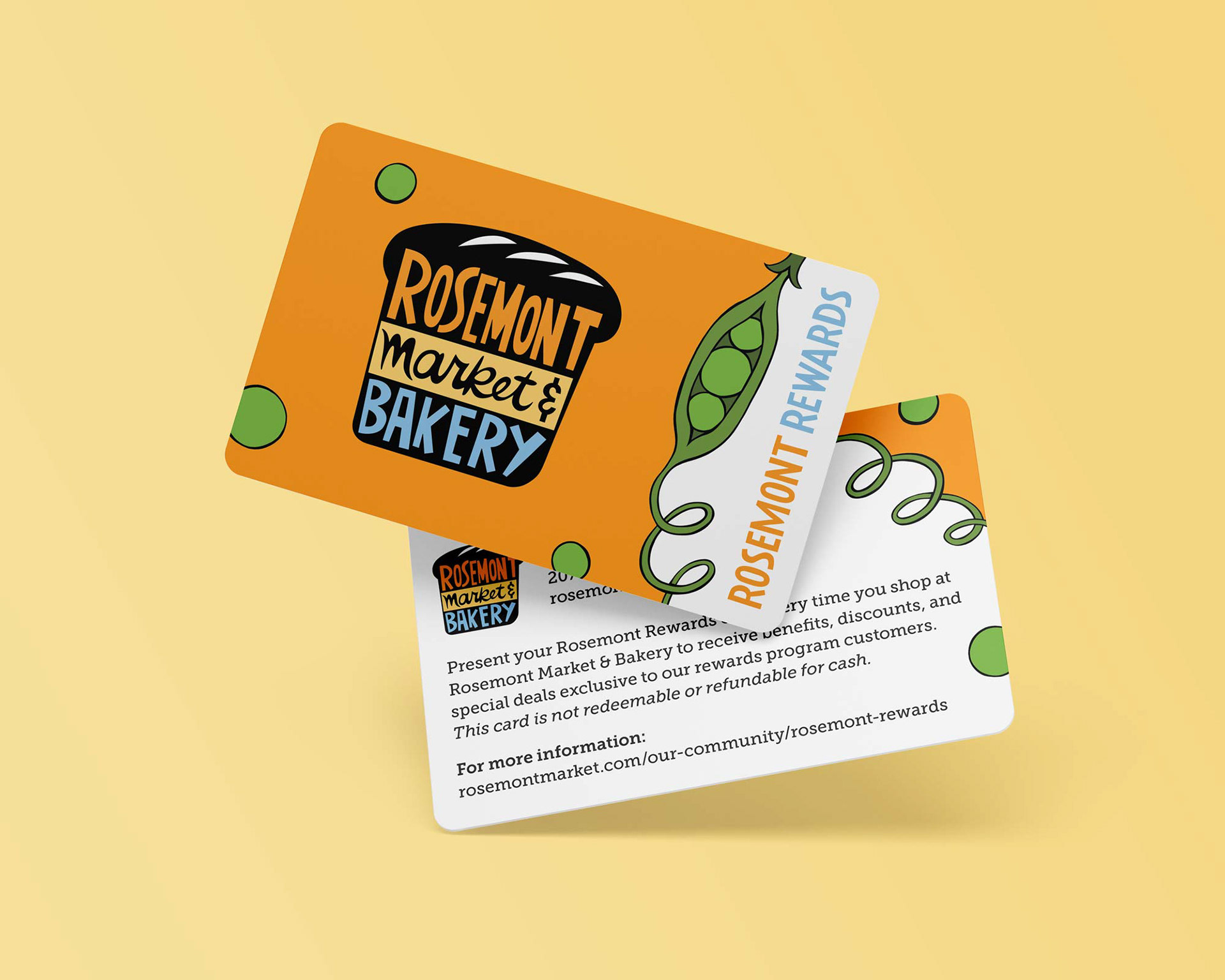
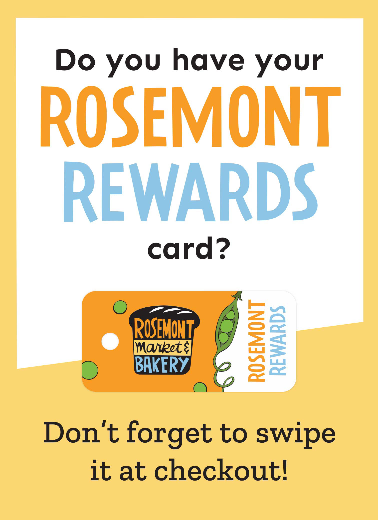
Defining Rosemont Market & Bakery's visual language has helped the company to navigate many changes over the past few years. With a comprehensive system that lends itself to countless design needs, the Rosemont team can spend less time thinking about their brand and more time cultivating joy through local, fresh food.
Let's work together.
Have a project in mind? Let's chat about bringing your idea to life.
